Wednesday, March 12, 2014
Tuesday, March 11, 2014
Card Dance

Game in Construct 2

I created the assets in Photoshop and saved them as .png24 w/transparecy. I imported them into the Construct engine and then gave each asset its own set of rules and functions. I enjoy Construct 2 and its usability so I think I will play around with it more in the future.
Thursday, March 6, 2014
The Wall Card Game Designs


For this assignment, we had to create four cards based on a card game called "The Wall." The object of the card game is to build up pairs of 3 wall cards and build four rows of walls. You also have a reinforcement card for allowing your wall (3 card set) to take an extra hit of damage from an opponents damage card. The fourth card design was what the back of all of the cards would looks like. This assignment was to be done to a specific size in Adobe Illustrator and maintain only vector graphics. I used various techniques to create this cards. I used gradients, the pathfinder tools, and alt+dragged tons. I think these cards would be an incredible set if they are chosen to be printed and I would enjoy playing a game with a set of cards I created. Overall, I am very pleased with how the final cards look even though I was quite rusty using Illustrator. What can I say? Photoshop is king.
Wordpress Site

My wordpress webpage can be found here.
Sunday, March 2, 2014
Email Newsletter
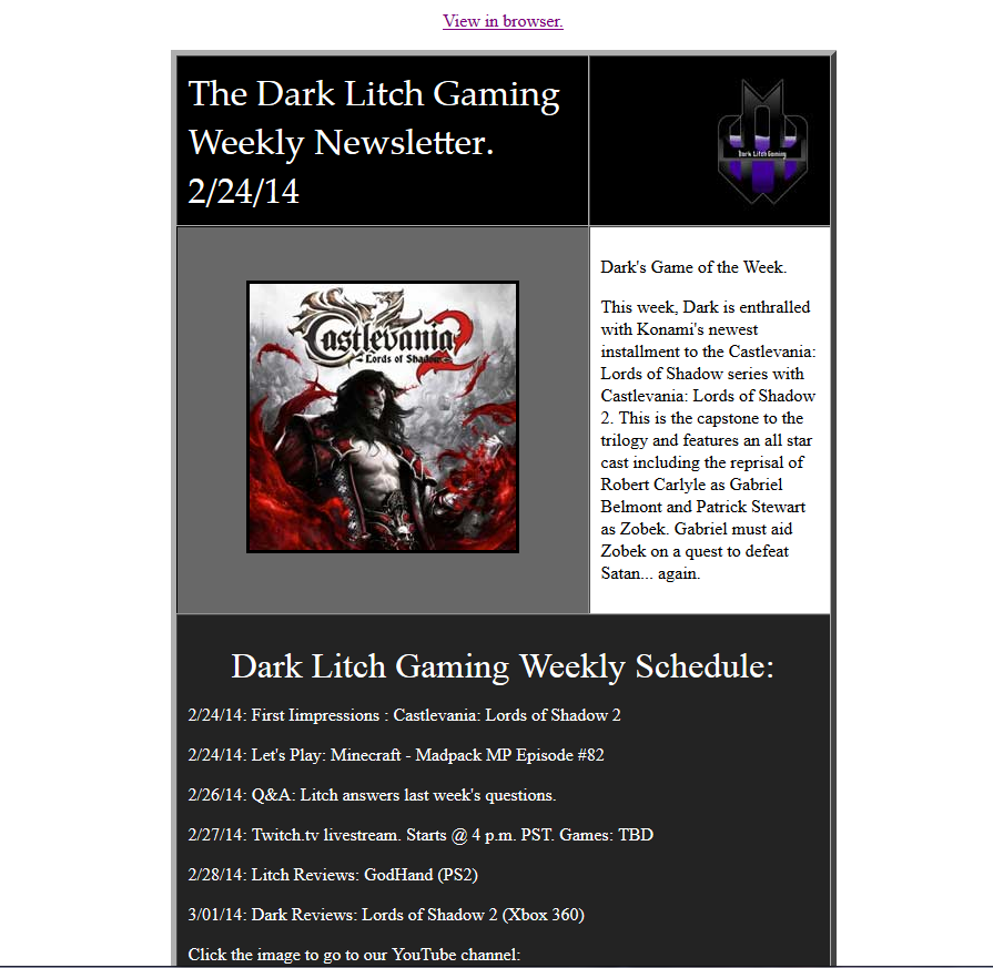
For this assignment, we had to create an email newsletter and email it to our instructor. This assignment is something that I should have given more attention to. I know the technical work is where I'd get my points, but overall it was a quick creation. I have a full plate and this was the one assignment that I think fell short.
Website template reconstruction.

Sunday, February 23, 2014
Sliced Webpage

I had to create an image in Photoshop then slice it all up and import it seamlessly to Adobe Dreamweaver. Sounds like a challenge. I managed to pull it off with some trial and tribulation. The technical aspects of this project were more evident while combining all of the slices in Dreamweaver. If even one pixel is off, you have a problem. Creating the image in Photoshop was quite easy and so was the slicing. Once I saved each slice separately as .png images, I had to create space (divs) in Dreamweaver and place the slices as the backgrounds to those divisions. I did have some troubleshooting over the positioning of the divisions but I think I handled it decently. I have pretty high hopes for my grade on this project since I spent quite a bit of time creating it and making it look solid.
HTML5 Slider images


The first image is the original, and the other two images are variations of the end result. This assignment was to create an interactive HTML 5 slider image that a user can click to change the text. I had a few issues with the text not turning out how I wanted it to. I made both end results and decided that I liked them both but I liked the final image with the black background and not the lightning one so much. The text needed to match the word with the theme. I chose the word Rain because I enjoy the fall weather quite a bit and its part of my gaming name (DarkNiteRain). This assignment was done with Adobe Edge Animate and Photoshop. I used Photoshop to create the text and finished results. I imported them into Adobe Edge and gave it some interactivity. Overall, I really enjoyed the assignment and the final result. The one thing I don't think I did very well on, was the overall size of the images. The originals were made in HD 1920 x 1080 and therefore the final result is quite large in size.When ya have HD pounded into your brain, its hard not to make it the default size for most projects. *Thanks Beeg*
Skull Animation
For this assignment, we were tasked with animating shapes in After Effects to create a design and to learn the shape layer animation tools. I created the entire picture in Illustrator so that I would be working with vectors. After I imported the illustrator file into AE, I created outlines of each object and converted them into shape layers. Then, I applied all of the keyframes and fired off a test render. Well that didn't work so well. Back to the drawing board to make some adjustments. This process occured multiple times and needless to say, I am pleased with the finished result. The eyes got a little funky while rendering but no matter what I tried to fix it, it still occurs when i render it from After Effects. Overall, I enjoyed this project and the final result. I wanted this to be sort of an expansion on my vinyl sticker and the only thing that really shows the link between the two is the text on the head. Still looks awesome! The audio is from flashkit and everything else was created from scratch by me.
Sunday, February 9, 2014
SLAM covers and folios


Here are some SLAM magazine covers I created as well as two Folios to go with the designs. I wanted the folios to be interchangeable with the covers. I used Photoshop to create the covers and Illustrator to create the folios. For the covers, I used various filters and effects to make each cover have a nice solid look to it. I really enjoyed making the covers and I feel like they show off my skills quite well. I think I will do quite good on this project and hopefully my cover gets used on SLAM magazine.
For the creation of the folios, I used Illustrator to create the basic shapes I wanted and then I used the pathfinder tools to hollow the shapes out and allow me to shrink and stack smaller shapes inside.
Dark Vinyl Sign


Thursday, February 6, 2014
Drawing Tablet Digital Painting - Pyramid

Thursday, January 30, 2014
Jquery Photo Gallery

For this assignment I wanted to showcase some of the projects that I have been creating during my time at Pierce College. Using Jquery in combination with basic html coding, I was able to generate an incredible gallery with a very nice look to it. The technical aspects of the project were review of things that I had done in Web Design and CSS class. I really enjoy the process of creating artwork and the gallery is a great way to show off that art! I feel like this gallery will do its job and show my artwork off to the world.
See the gallery here:
http://www.ddsgn220.volume11.com/David/david.html
3D popup photo gallery.
For this 3D popup assignment, I really wanted to use a bunch of pictures that have my daughter in them. I used is as a platform to create something wonderful that shows the growth of my little girl. I really enjoy how the video turned out and plan on doing similar projects with different subject matters in the future. I took each photograph and placed it into three-dimensional space using Adobe After Effects. Once all of the pictures were positioned, I used a 3-d camera rig to animate through all of the pictures. The final project turned out almost as good as I hoped. There is always room for some improvement.Click the image to be redirected to the video. (Youtube link)
Sunday, January 26, 2014
Font sheet part 2: Lower Case and special characters
 Here is the other half of my font set, this sheet shows the lowercase and special characters. I created the whole font at one time but due to the assignment requirements, I had to make a font sheet for the lowercase characters separately from the capitol letters. Overall the process was the same as the capitol letters only the special characters took a little tweaking to make look decent. I am happy with the font as a whole and would like to make another one at some point in the future. I really liked learning how to make my own font as it can be useful to be able to create a custom font for a client if they request it or its necessary to the work I'm doing for them.
Capitol Letters Font Sheet
 For this assignment, I was really trying to create a font set that I could use for a few projects that are on the shelf right now. I didnt want my font to be normal everyday characters but instead be an original looking font. The font I developed looks like a cross between electricity and the papyrus font. I like the end result quite a bit and cant wait to use it for a project. The process of creating this font set was to draw each glyph in Adobe Illustrator, combine all parts to form one solid letter and then copy the letter to the font sheet (seen above) and to paste each character into Font Creator 4. After each glyph is placed in FC4, I had to adjust each character to be very close to the same size and adjust the leading and kearning marks so that when being used, the font doesn't overlap letters.
Thursday, January 9, 2014
With this project I was trying to use a picture of my dragon painting from a previous painting class. I really wanted to make the dragon have some level of activity and therefore gave him some flames and smoke. The water adds a nice touch to this video and the still image as well. In creating this project I had to take a picture of the dragon painting and use photoshop to remove all backgrounds. I took the painting and added multiple layers to create space for the water, fire and smoke. After those elements were painted onto their own layers in Photoshop, I saved and opened the .PSD document into Adobe Flash. I converted the Photoshop layers into Flash layers and then created an additional layer for each of the painted elements. I used masking in flash to create the animated look of each element. I also used a motion tween for the smokes movement instead of masking. I then exported the project from Flash and imported it into Premiere Pro to add the music and intro. Overall I am very happy about how this project turned out and I really enjoy the still image featured in my previous post.
Wednesday, January 8, 2014
 |
| Dragon art thumbnail. Taken from DDSGN220 video. |
Hello, my name is David Lovell and
I have a background in digital design and graphic design. My strengths include
the use of Adobe Photoshop, Adobe Illustrator, Adobe Dreamweaver, Adobe After
Effects and Adobe Premiere Pro. I also have training with Newtek Lightwave for
3D modeling, texturing and animation. I
am nearing the completion of my Digital Design degree from Pierce College with
a 4.0 grade point average and have expanded my artistic prowess extensively
while attending Peirce College. I am
highly motivated to involve myself in graphic design or video based projects and
offer a unique artistic viewpoint to further push the boundaries of any
projects that I contribute to. I strive to showcase my skills in the best way
possible for all parties involved and give a unique feel and vision to artistic
works whether personal or professional.
Monday, January 6, 2014
Subscribe to:
Comments (Atom)